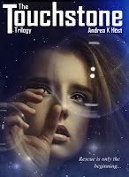
Hm, for the moment going with option 3 for Touchstone. Now I'm playing with the titling and placement of the stars.
And on an unrelated note, this week's Doctor Who was a return to good, solid story-telling. Only real glitch was the complete emotional disconnect between this and the previous episode.


The right one, definitely. The "Trilogy" on the right one is barely understandable though in the small size. I'd suggest you leave it horizontal. The tagline adds a lot of balance. Much better.
ReplyDeleteYes, having her neck visible makes the whole image more graceful and open. And I also like the trilogy horizontal
ReplyDelete